Stages Theater
Bigger than the stage

Client:
Stages
Studio:
Freelance
Responsibilities:
UX, Design Direction
Credits:
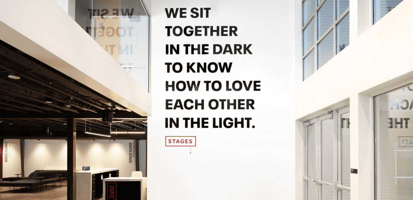
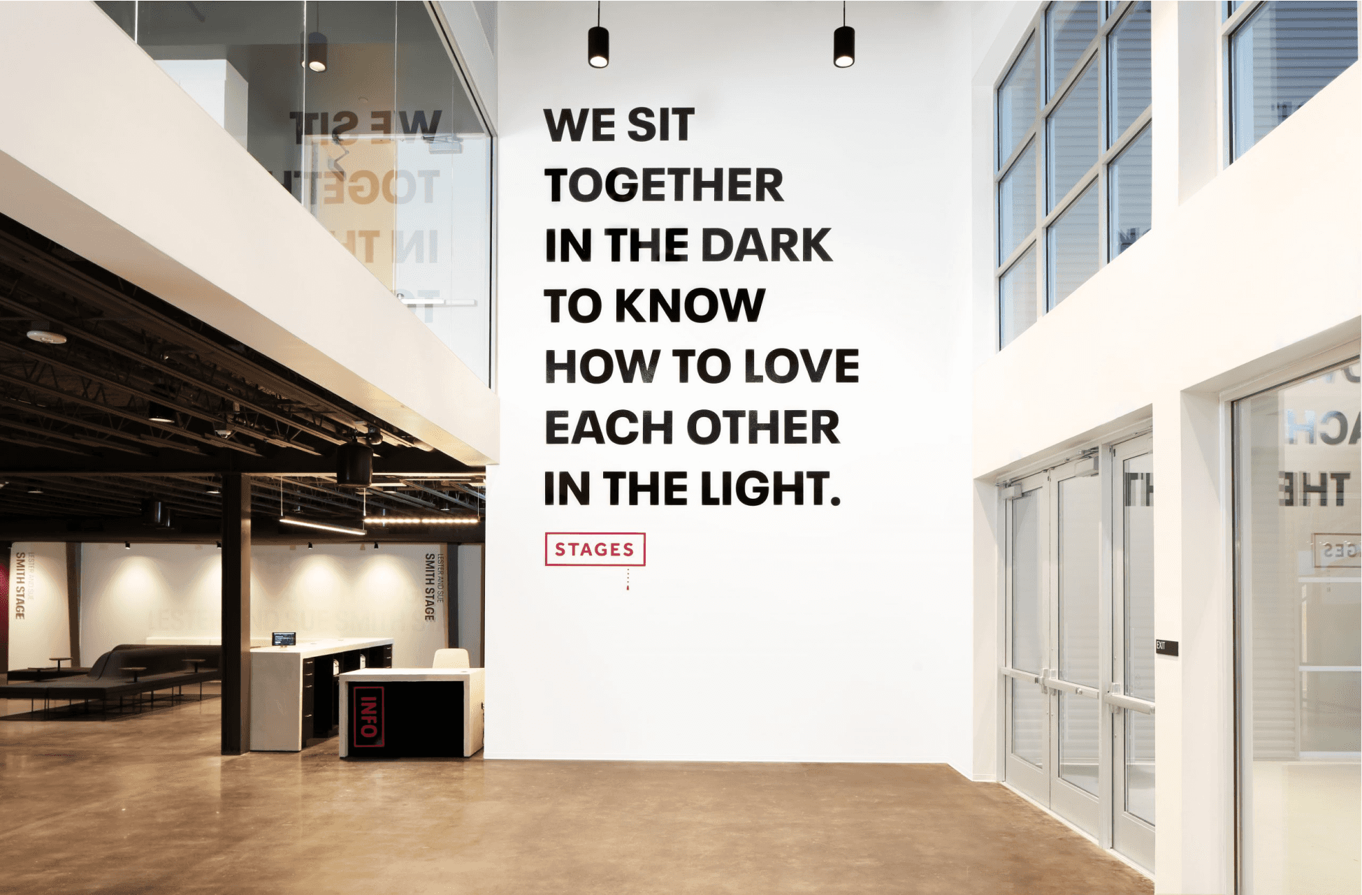
Stages Theater’s main tagline reads; “We sit with each other in the dark to know how to love each other in the light.” Beyond enjoying a fine crafted show, their stages are all constructed to be in the middle, with seats facing each other in intimate settings. Their productions, mostly written and performed by local artists, implore the audience to take away much more than what they see on stage, but what we all see in each other.
Needless to say, this website needed to tell a story, all while being easy to navigate in their many offerings. I was honored to help them bring their vision to life.

Tyler Rand, Director of Marketing and Growth
“Nadia completely captured the heart and soul of Stages. I have been working in the arts for almost two decades now, and I have never seen a digital presence of an arts organization so closely fit their physical presence and capture their ethos. So often, websites turn into lifeless e-commerce boxes that are just mobile-friendly ticketing sites. What she built was an experience—a people-centric avatar of the Stages identity. It’s absolutely amazing.”

Purchase Flow
Users are never too far away from a seamless purchase flow, by integrating a secondary nav of the show's title and purchase CTA. Before getting pushed to the third party ticketing platform, users can select the date and time of the show all in the same page. Stages used Spektrix for ticketing, which limited the customization of features and brand integration, but was handled with care. The most important part of the site is that it functions correctly, but we all worked hard to make sure we could work around such limitations, resulting in a seamless experience for the user.
